Our

Work

Orange Lines

Our

Work

The team at OtherBirds has compiled an impressive portfolio over the years – combining the experience of its two origin agencies. We have collaborated with clients across Victoria and New South Wales, expanding our reach into New Zealand and the United States. These have included industries such as retail, fashion, hospitality, engineering, construction, finance, waste management and many more!

Discover the OtherBirds difference, and put yourself in the shoes of some satisfied clients.

Halve Waste IMAGE

Halve Waste

The Brief

OB Logo

Halve Waste

Orange Lines

Branding
Graphic Design

Challenge:

The Halve Waste program brought together six councils in the Albury and Wodonga regions with a united vision – reduce waste in the community. 

Solution:

In the beginnings of this successful campaign, we worked with well-known celebrities and local ambassadors while the three-bin system was being established.

As the campaign evolved, the community took more responsibility about how they recycle and get rid of waste. It was then the celebrities passed the baton to the locals, who continue to support Halve Waste’s endeavours.

Results:

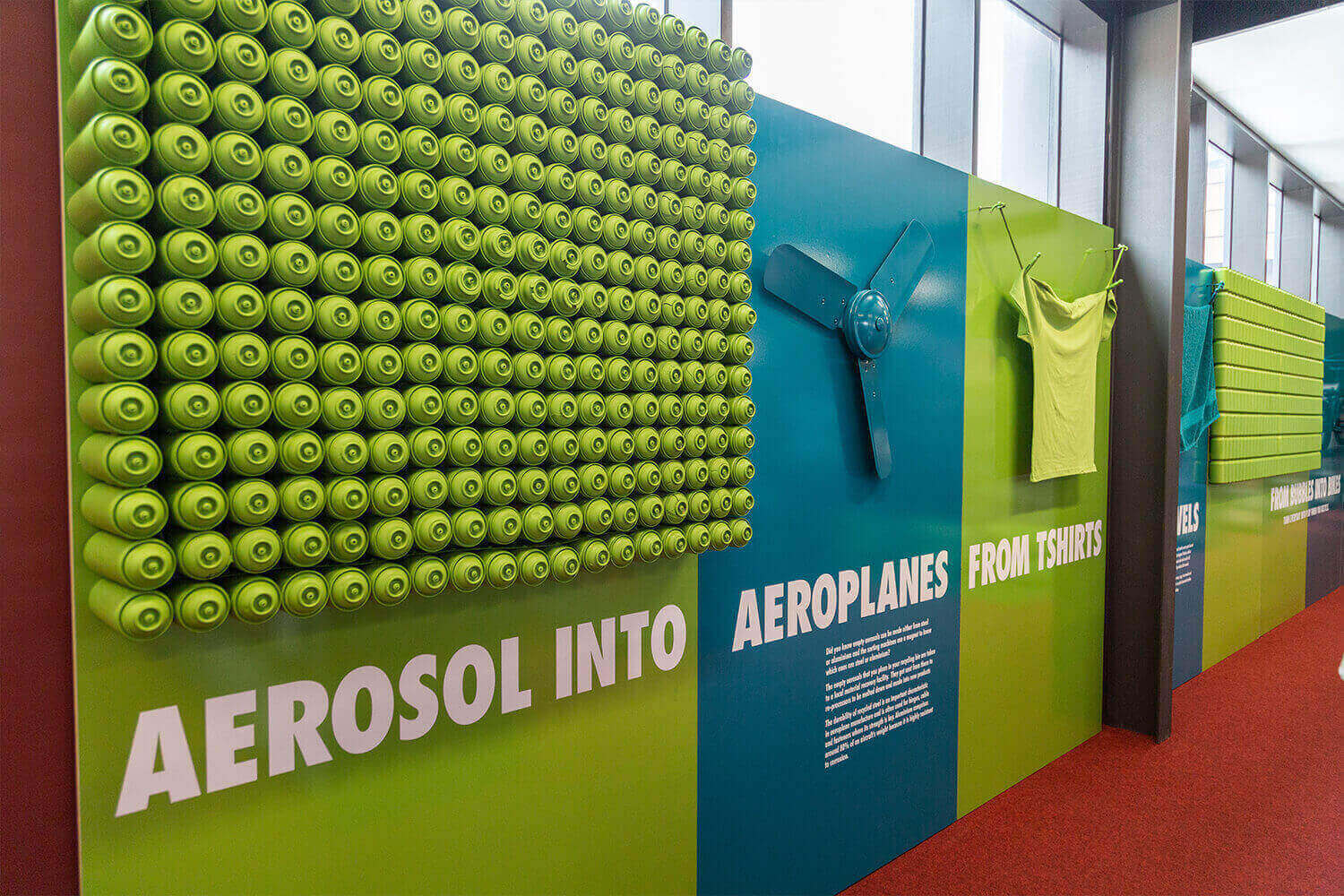
OtherBirds have been proud partners of the Halve Waste program for several years. We’ve worked closely with Halve Waste to develop a diverse library of assets.

We’ve also created unique campaigns that addressed different waste concerns, which aligned with a strategic media plan that factored in total budget, environments, and the wider community.

Close

X

Hero BANNER IMAGE

Little Locals

The Brief

OB Logo

Little Locals

Orange Lines

Branding
Graphic Design

Challenge:

Moving from the big smoke or from another town can be a big deal.There is a lot to think about and lots of reasons to make the tree change. One of the big reasons is lifestyle and getting quality time back in our days, quality time for family and time to just let your kids be kids.If the kids are happy, you’re well on your way to settling into your new home town.

Solution:

 This is where we handed it over to the experts; the kids who have made the move. They also got a little help from some true blue, born and bred Wangarattans too. This was where they told us what they love about Wang and in the process show off everything it has to offer.

For this approach, we reached out to find a mix of children with different backgrounds, hobbies and interests. They were chosen to cover off a range of benefits of living in Wangaratta ie. ‘lots of land and space available’ and also an opportunity to showcase local amenities like schools, sports facilities and arts precincts. It involved a casual chat/interview with the kids about their favourite things and we aimed to capture some genuine and passionate responses.

Results:

This project resulted in an adorable video that showcased what kids really want. 

Close

X

ROLL UP FOR OUR REGION IMAGE

Roll Up For Our Region

The Brief

OB Logo

Roll Up For Our Region

Orange Lines

Audio & Video

Challenge:

During the height of the pandemic, it was important that Albury Wodonga Health educated the community on the benefits of getting the COVID-19 vaccination.

They didn’t want to scare or overwhelm the community and were after a considerate and nuanced approach to messaging.

Solution:

We worked closely with Albury Wodonga Health and a network of other health organisations to come up with gentle, yet effective, messaging that encouraged our community to get vaccinated.

Results:

We created a suite of memorable assets to help educate the community about why it’s important to get vaccinated against COVID-19. This included newspaper ads, window decals, videos and a branded bus.

Close

X

Omega 3 Milk Image

Omega 3 Milk

The Brief

OB Logo

Omega 3 Milk

Orange Lines

Branding
Digital Marketing
Graphic Design

Challenge:

The objective for this brand was to create the first Omega 3 rich milk, packed with proven health benefits and market it as an industry innovator.

Solution:

This required future proofing the business by creating branding that was timeless and appealed to parents and young families.

OtherBirds created a fluid hand draw design to appeal to this audience with the unique ’03’ carried across the entire product range.

Results:

A bright cartoony brand was supported by an animated campaign that is a bit of fun but will also clearly spell out the health benefits of the product.

Close

X

ENZED IMAGE

Enzed

The Brief

OB Logo

Enzed

Orange Lines

Graphic Design
Photography

The people at ENZED are here to support the backbone of our country. They work hard at all times of day and often in tough conditions.This approach was built around one key idea: that ENZED is here to make sure you can keep working.

By demonstrating an understanding of just how hard ENZED’s customers work, we’re showing a grasp of their business and how important it is for them to stay online.

This commercial was shot at times of the day when others may be closed and allowed us to show the 24/7 support they provide their clients.

Challenge:

ENZED work hard at all times of day and often in tough conditions, ensuring that they’re here to help us keep working.

They wanted to highlight just how hard their customer’s work and showcase why it’s important for ENZED to stay online. 

Solution:

We proposed a multi-layered digital media schedule, including an initial two-month TV campaign combined with extended digital activities over a five-month period. Our overarching strategy was based on reaching a specific, key target audience of business owners and decision makers across a range of relevant industries.

Results:

A series of TV commercials and digital assets were created to target the core male audience. These authentic videos and images reiterated ENZED as the go-to provider of machinery and equipment for tradies throughout Australia and New Zealand.

Close

X

Zeroda IMAGE

Zeroda

The Brief

OB Logo

Zeroda

Orange Lines

Graphic Design
Media & Strategy

Zeroda is a sports detergent that was launched into the Australia market in 2018. We were tasked with creating a name, brand and packaging to support the launch.

Taking inspiration from sports and tech industries we developed a modern fluoro brand that would appeal to high performance athletes and sporting enthusiasts. The ‘o’ has been highlighted to emphasise the ‘zero odour’.

The work we produced for them included:

  • Animation
  • Website
  • Packaging
  • Promotional Material

Challenge:

Zeroda is an innovative product designed specifically for athletes, sport-lovers and gym-goers alike. They needed support to launch their product and create a brand that would stand out from the crowd.

Solution:

Taking inspiration from sports and tech industries we developed a modern fluoro brand that would appeal to high performance athletes and sporting enthusiasts. The ‘o’ has been highlighted to emphasise the ‘zero odour’.

Results:

We created a modern, sleek, and distinguished design that makes an impact. The brand support extended via creation of animated videos, website development, as well as creating packaging and promotional materials.

Close

X

Rehab Co IMAGE

Rehab Co

The Brief

OB Logo

Rehab Co

Orange Lines

Digital Marketing
Media & Strategy

We were engaged to develop an updated logo and guidelines for the RehabCo brand that would deliver consistency in the messaging and style across all mediums. 

This included designing and developing a new website that was reflective of the current brand positioning in the market place considering NDIS requirements, clients being the insurance companies, individuals or employers.

We produced:

  • Logo Design
  • Website Design
  • Campaign Posters
  • Business Card Designs
  • Brochures

Challenge:

RehabCo wanted a fresh logo that catered to a contemporary clientele. They required consistency in their messaging and style across all mediums.

Solution:

While elevating the RehabCo brand, we updated their branding guidelines and logo that captured the importance of people. 

As part of this, we ensured that the primary and sub-brands spoke to all types of clients, insurance companies, employers and the injured parties.

Results:

No matter who creates collateral for RehabCo now and in the future, the messaging and style of the products will be consistent with the updated guidelines and branding.

Close

X

LUMA IMAGE

LUMA

The Brief

OB Logo

LUMA

Orange Lines

Branding
Web & Software Development

Challenge:

With Luma’s revolutionary product concept, they needed help to create the digital headquarters for their high-tech water bottle system.

Solution:

We collaborated with Luma to bring their vision to life, implementing a unique design for their website that reflects the sleekness and modernity of the bottle’s design. 

Our design and web development teams worked together on research, conceptualisation and execution on the elegant solution. 

Results:

Customers now have a memorable website experience for an exceptional product. Post-launch, the product has month-on-month increases in visitors, purchases and reach.

Close

X

Reflect Respect IMAGE

Reflect Respect Campaign

The Brief

OB Logo

Reflect Respect Campaign

Orange Lines

Graphic Design

Challenge:

The Wodonga City Council and Wagga Wagga City Council wanted to educate men on respecting women in an engaging and unique way. These councils wanted a more equal society for all genders by influencing how we think about unequal power, unconscious bias, rigid gender roles and stereotypes, and respectful relationships.

Solution:

We took inspiration from the 1900s gentlemen’s guide series of tips to create a suite of creative and fun marketing assets to educate men about treating people of other genders with respect.

We based the content of these deliverables off the information provided by a research company, who engaged with victims of intimate partner violence (IPV) along with stakeholders across multiple organisations.

Results:

Though tongue-in-cheek in nature, the Reflect Respect campaign has helped men rethink what they know about gender norms and treating people of other genders with respect.

Close

X

Wangaratta Racing, Wine & Food Festival IMAGE

Wangaratta Racing, Wine & Food Festival

The Brief

OB Logo

Wangaratta Racing, Wine & Food Festival

Orange Lines

Branding

This design project involved creating a brand that stood out from the crowd, featuring a carnival atmosphere with people, festival lighting, racing, food and wine.

Although the festival was situated in Wangaratta, the target audience was to reach outside of the region, the aim was to have a brand that was attractive to Metro areas and appeal to a large demographic.

We produced: 

  • Television Commercials
  • Brochures
  • Posters
  • Website
  • Radio Audio

Challenge:

Though this iconic festival is situated in Wangaratta, the Wangaratta Turf Club wanted to expand the event’s awareness to metropolitan areas.

Solution:

We created a distinct and bold brand that reflected the fun atmosphere, tasty offerings and the heart of this great festival.

Vibrant colours and a large font were used to stop people in their tracks and take notice of the brand and what the festival had to offer.

Results:

We developed a range of collateral to help boost the messaging of the Wangaratta Racing, Wine & Food Festival. This included engaging TV commercials and radio ads, eye-catching posters and brochures, as well as car decals and t-shirts!

Close

X

SHEPPARTON FOODBOWL IMAGE

Shepparton Foodbowl

The Brief

OB Logo

Shepparton Foodbowl

Orange Lines

Photography

We were engaged by Shepparton Council to help claim the title of ‘The Foodbowl of Australia’.

For many people, the source of their fresh fruit and ingredients for their meals is unknown. For our approach we wanted to remind people where a lot of their food comes from and to portray Shepparton and the Goulburn Valley as a hub for fresh produce with a thriving and diverse cuisine culture to boot.

To achieve this, we created a new brand ‘Shepparton Food Bowl – the source of it all’ and created a cookbook full of local produce, restaurants and their recipes.

Challenge:

For many residents in Shepparton, they were unaware of where their fresh produce originated from. The Shepparton Council wanted a fun, creative and engaging way to remind Shepparton residents of the great produce they have right in their backyards.

Solution:

We helped the Shepparton Council claim the title of ‘The Foodbowl of Australia’. As part of our approach, we aimed to remind people where a lot of their food comes from.

We also portrayed Shepparton and the Goulburn Valley as a go-to hub for fresh produce with a thriving and diverse cuisine culture to boot. 

Result:

A sleek, modern new brand was created, ‘Shepparton Food Bowl – the source of it all’. We also created a bright and energetic cookbook that is full to the brim with local produce, restaurants and their recipes.

Close

X

Webmatrix Examples of Work Pages

Orange 360

The Brief

OB Logo

Orange 360

Orange Lines

Branding
Graphic Design

Challenge:

The Orange region reaches across many unique towns and villages with many exceptional events and destinations to offer travellers to Australia. 

Though there wasn’t an efficient way to connect tourists with local tourist operators. 

Solution:

We created the initial information architecture (IA) that captured the key events and attractions. This was before Canvas Group, a Sydney-based agency, translated our IA into a world-class design.

From there, we integrated tourism operator data from the Australian Tourism Data Warehouse. In addition to this, we integrated with the booking platform allowing tourists to see availability and book in real time.

Results:

Tourists looking to explore the Orange region now have a holistic platform where they can easily connect with tourism operators.

Close

X

Yarra Health_Pages from DMM9999 Albury Wodonga Health Proposal 2

Yarrawonga Health

The Brief

OB Logo

Yarrawonga Health

Orange Lines

Branding
Graphic Design

Challenge:

With a 100-kilometre service area with a catchment of around 10,000 people, Yarrawonga Health needed a solution for managing multiple streams of sensitive documents and knowledge sharing and managing organisational knowledge.

Solution:

Working with Yarrawonga Health to develop a holistic online system comprising a website, intranet and app you can download onto a phone or tablet.

These three key components allowed for brand modernisation and a streamlined customer journey.

Results:

Centralised information allows users to have a single platform to upload relevant information, which simplifies health care processes. 

This considered solution will serve Yarrawonga Health and their patients for many years to come.

Close

X

Wodonga Council

Wodonga Council

The Brief

OB Logo

Wodonga Council

Orange Lines

Branding
Graphic Design

Challenge:

Council digital assets had previously been spread across multiple technologies resulting in a fragmented user experience as well as unnecessary cost.

Solution:

After assessing the various websites, many born from inflexible technologies and outdated platforms, we were able to consolidate 3

websites into one solution. This solution was delivered on the DNN which allowed us to also redevelop The Cube Wodonga (entertainment centre) website in parallel on the same

platform. 

We also delivered a suite of templates for the council to deploy microsites as they are needed. These microsites can have a basic navigation structure and be easily branded to reflect the style of the campaign.

Results:

The website design is light, bright, bold and modern and was launched back in July of 2019 as planned.

Close

X

Balanced Life Dog Rolls

Balanced Life Dog Rolls

The Brief

OB Logo

Balanced Life Dog Rolls

Orange Lines

Branding
Graphic Design

Challenge:

Diet is an important aspect of any animal’s wellbeing. The challenge for this campaign was to create an engaging way to showcase this. 

Solution:

Working within the existing Balanced Life brand guidelines, we created a humorous campaign to launch their new dog rolls all with a little help from a French Bulldog. Whether it was high protein, low carbs or an overall perfectly balanced diet, she had a doggy yoga move for all of them. 

Results:

The Balanced Life campaign launched with a targeted digital media campaign surrounding specific chain and independent pet stores across the nation, with geo targeting and other behavioural parameters. 

Six weeks into the campaign launch the marketing team was informed of freight and distribution issues that meant nearly half the stores didn’t have the full range, and then an education piece was required to educate the stores on the process behind the freight and storage of a cold store product. 

The campaign included instore POS, press, socials and campaign page.

Close

X

ShipStation

ShipStation

The Brief

OB Logo

ShipStation

Orange Lines

Branding
Graphic Design

Challenge:

ShipStation required graphic design services to emphasise their position as industry leaders. Their production timelines required for this brand were heavily influenced by the needs of the global team activities. 

Solution:

We worked with ShipStation to develop a suite of marketing resources to elevate their brand, including an extensive suite of graphic design assets to support them across physical and digital platforms.

Results:

ShipStation was enabled to boast exciting activations through multiple events as content creation and collateral design were driven to new standards. They were also able to provide visually engaging content for a range of target audiences. 

Close

X

Randwick City Council

Randwick City Council

The Brief

OB Logo

Randwick City Council

Orange Lines

Branding
Graphic Design

Challenge:

Randwick City Council were set to introduce their food organics and garden organics (FOGO) waste collection to households in the area in March 2021. 

But they needed support to get the community to understand why this change was so important for their environment. 

Solution:

OtherBirds worked closely with Randwick City Council to develop a suite of animated videos to create a long-lasting, positive impact on the community. We created the ‘Small Change, Big Difference’ campaign to inspire the Randwick community individuals to understand that every little bit counts.

Animation was used to showcase recognisable locations that locals can connect with, such as beaches, parks and outdoor recreational areas. This helped locals understand the benefits when they close the loop and recycle their food scraps.

Results:

This effective campaign was recognised as the overall Winner in the Behavioural Change in Waste Category at the Local Government NSW Excellence in Environment Awards for 2021.

Close

X

Accelerate growth on a platform that won't hold you back

BigCommerce

The Brief

OB Logo

BigCommerce

Orange Lines

Branding
Graphic Design

Challenge:

BigCommerce wanted to educate online fashion retailers about the key trends that are set to shape and define the fashion industry.

Solution:

Our copywriting team conducted extensive research about the trends that drive the fashion industry through the lens of eCommerce and online shopping.

They wrote an extensive report that features important data and cases studies to corroborate the impact of each trend.

The report’s design was sleek and complemented BigCommerce’s overall brand, while making the key figures stand out and more engaging.

Results:

The client was happy and satisfied with how we worked, our proactivity and responsiveness.

Close

X

Drive Yello

Drive Yello

The Brief

OB Logo

Drive Yello

Orange Lines

Branding
Graphic Design

Challenge:

Drive Yello wanted an engaging way to educate businesses about evolving consumer behaviours and the importance of last mile delivery.

Solution:

Our copywriting team researched and wrote an eBook that explained the reasoning behind the change in customer behaviour, and how retailers can change their approaches to meet their consumers’ needs head on.

The sleek eBook design allows for ease of navigation and highlights key pieces of information that are crucial to businesses.

Results:

Novice and veteran retailers are now equipped with the knowledge they need to meet evolving customer demands head on and make their business soar.

Close

X

Bentleigh RSL

Bentleigh RSL

The Brief

OB Logo

Bentleigh RSL

Orange Lines

Branding
Graphic Design

Challenge:

The Bentleigh RSL wanted a way to engage new audiences via Facebook to share news, the latest menu offerings and any updates about the RSL.

Solution:

Our design team ongoingly creates a series of vibrant tiles that, at a glance, tell audiences what they need to know when scrolling through their Facebook feed.

The use of bold and bright colours draws the eye and makes Facebook users stop in their tracks to look at the tiles and read the captions.

Results:

Including diverse images of people young and old allows audiences to establish more of a connection with these demographics. Additionally, the use of vibrant colours allows for an aesthetically pleasing feed that caters to RSL patrons of all ages.

Close

X

Agency Stack

Agency Stack

The Brief

OB Logo

Agency Stack

Orange Lines

Branding
Graphic Design
Web & Software Development

Challenge:

Engaging audiences across Twitter and LinkedIn, Agency Stack needed to maintain a consistent stream of organic social media content each month. 

Solution:

Working within a 280-character limit on Twitter meant that our team created tiles and videos that packed a punch, accompanied by a snappy caption to draw in users.

On the flip side, the LinkedIn platform allowed us to share blog posts and extend Agency Stack’s reach through the use of captions, polls and articles.

Results:

Regular posting meant that Agency Stack’s online presence was consistent and the audience has been growing with each post.

Close

X

Sunshine Week2

Albury Wodonga Regional Cancer Centre (AWRCC)

The Brief

OB Logo

Albury Wodonga Regional Cancer Centre (AWRCC)

Orange Lines

Branding
Graphic Design

Challenge:

Sunshine Week is an organisation that stems from the work at the Albury Wodonga Regional Cancer Centre (AWRCC).

During its conception, AWRCC required a fun and youthful brand for Sunshine Week.

Solution:

To create this bright and vibrant brand, we worked in colours from the original AWRCC brand as well as distinct typography to create a fun brand. We also selected images that the community could easily connect and identify with.

Results:

The combination of colour, typestyle and imagery gave the Sunshine Week branding an emotional and compassionate connection with the community to become involved in the campaign, raise awareness and funds for the AWRCC.

Close

X

coffee

Kiewa Milk

The Brief

OB Logo

Kiewa Milk

Orange Lines

Branding
Graphic Design

Challenge:

Kiewa Milk wanted to remind locals why milk sourced from the Kiewa Valley is the best when it comes to dairy products.

Solution:

We took inspiration from the 1900s gentlemen’s guide series of tips to create a suite of creative and fun marketing assets to educate men about treating people of other genders with respect.

We based the content of these deliverables off the information provided by a research company, who engaged with victims of intimate partner violence (IPV) along with stakeholders across multiple organisations.

Results:

A fun and vibrant campaign allowed coffee connoisseurs, farmers and milk-lovers to celebrate the return of an icon.

Close

X

Wodonga City Council

Wodonga City Council

The Brief

OB Logo

Wodonga City Council

Orange Lines

Branding
Graphic Design

Challenge:

Wodonga Council identified reducing drug and alcohol related harm as a key priority to creating a safer and more equitable community. 

Solution:

We know the dangers and are constantly being told of the consequences of drug use, but for this brief we wanted to take a step back and think about what drives young people to problematic drug use. 

We used the evidence from a Needs Analysis and asked the teens to flip drugs on their head. We got the teens to think about the things in life that would help them or a friend to avoid developing any problems with drugs. 

These were thought starters, the rest was up to them.

Results:

Based on their understanding and research we placed an open call for entries to design a skateboard deck. A competition led to a gallery exhibition grand opening as the centre of an outdoor event for the entire community. There was a pop-up skate park, skate demos, skate competitions, plus food and music.

Close

X